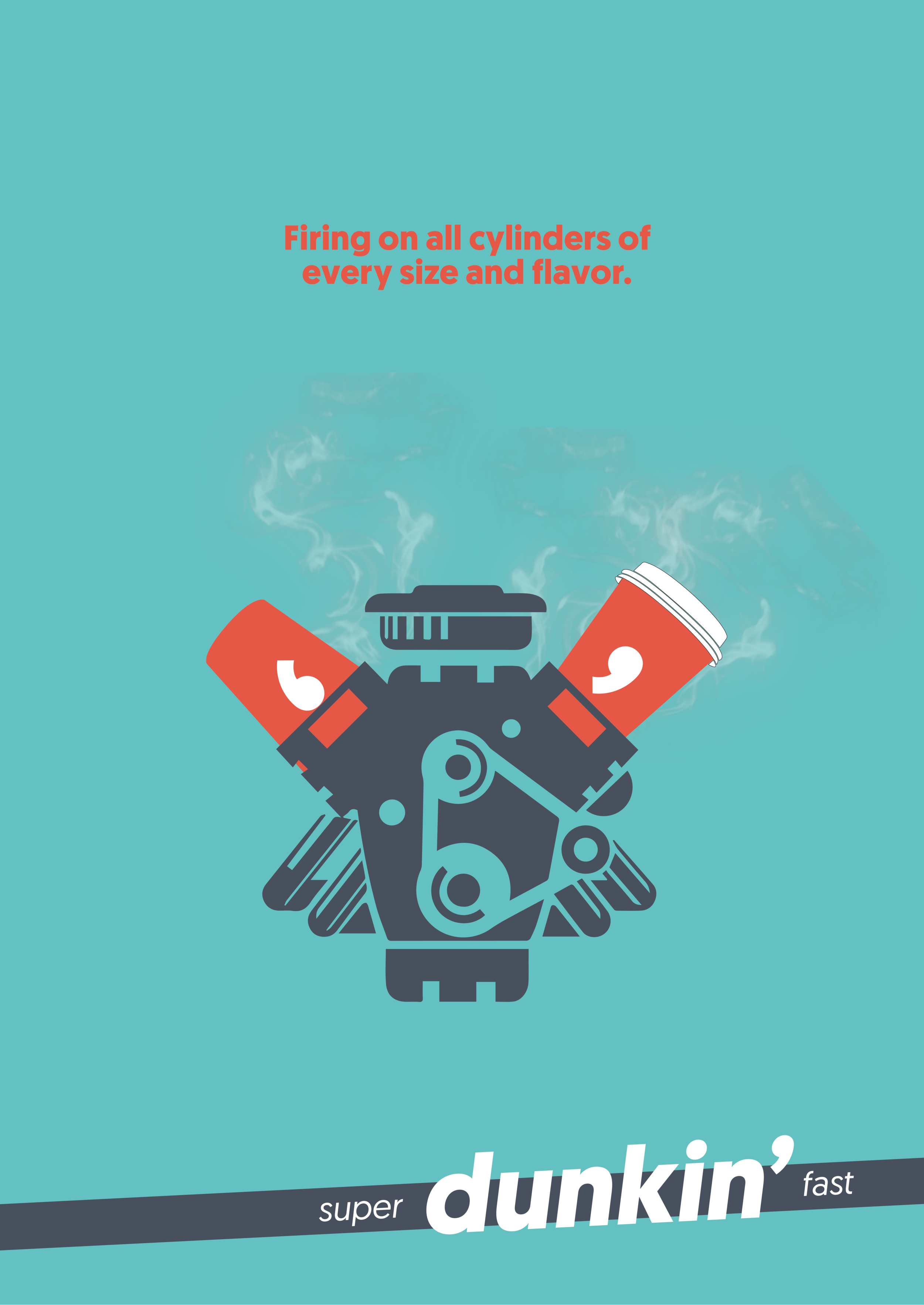
After its 2019 rebrand, DUNKIN’ still lagged a strong identity. For example, Starbucks owns “quality.” McDonald’s owns “cheap.”
But only DUNKIN’ can claim “Super Dunkin’ Fast!“
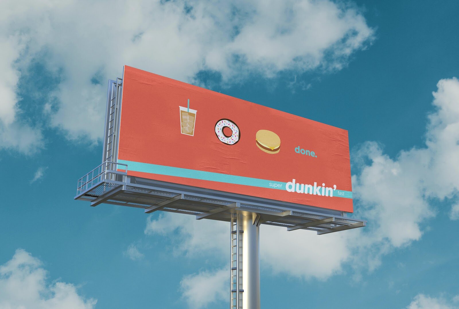
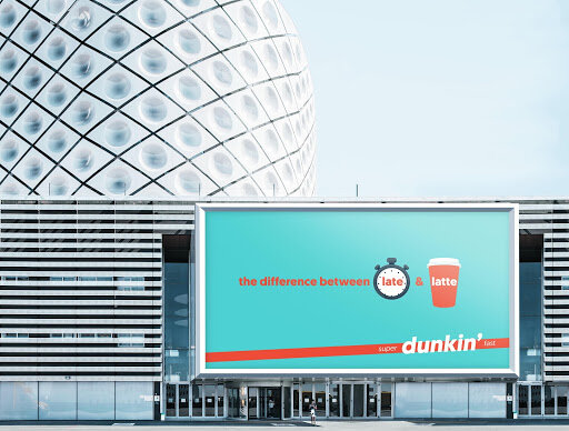
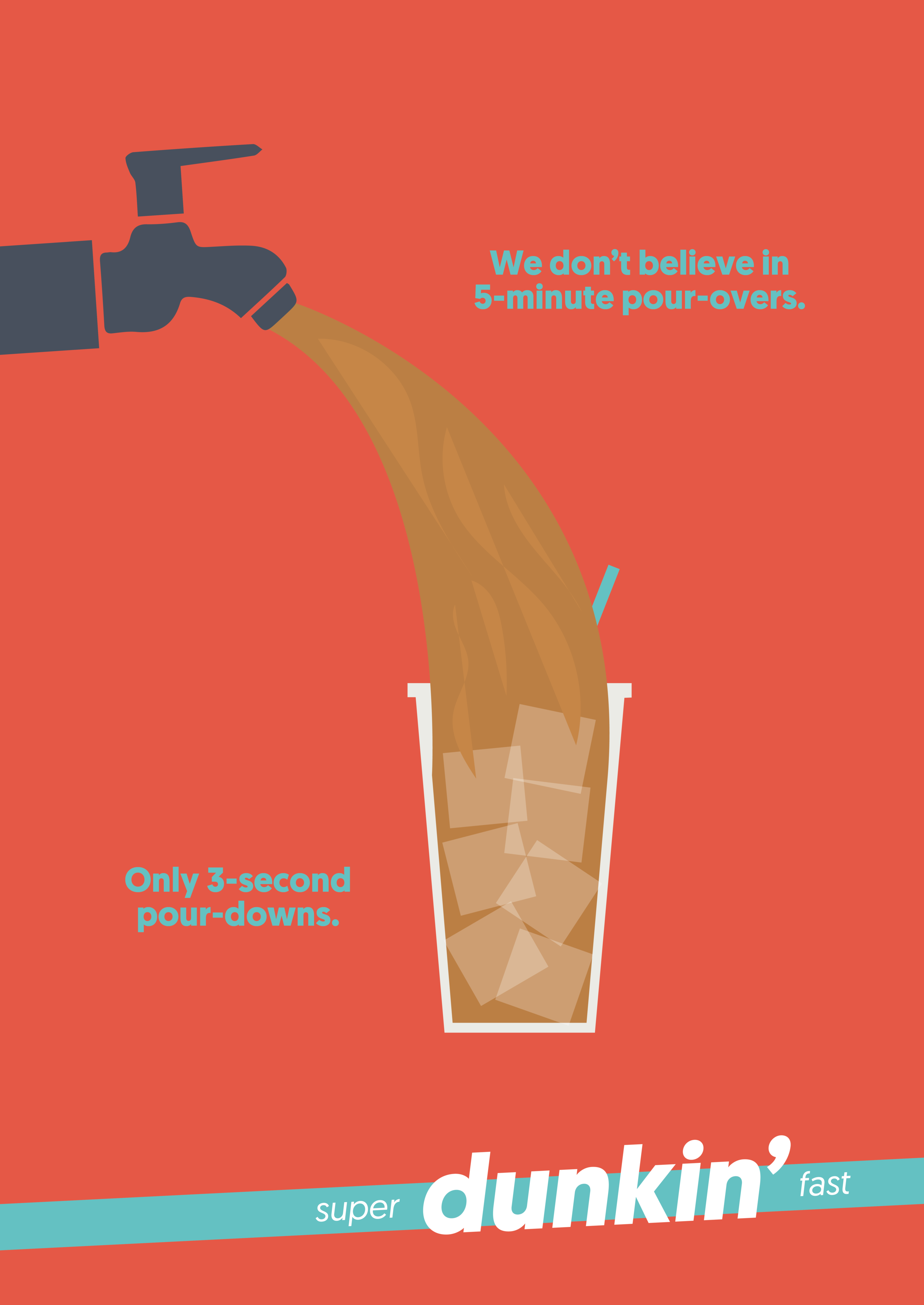
OOH boards will help us spread the word that Dunkin’ is quicker than its competitors.
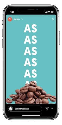
To reinforce the idea of speed, Dunkin’s Instagram Ads will get the idea across, even if you skip the ads on purpose.

30-second radio ads will play on Spotify, Pandora, and regular radio stations.
Everyone wants to get right to the point. These pre-rolls will let them get right to it
at the Speed of Dunkin’.
Dunkin’ will also sponsor YouTube Skip Ad Buttons on other ads.

The Redesign
Dunkin’ updated its colors to fit into a more contemporary world.
An emerald green was chosen for longevity and its connection to coffee, along with a deeper orange and blue-ish green to subdue the flashy, high-contrast of their current colors.
The apostrophe serves as a symbol of speed and brevity.


The app: Dunkin’s app was redesigned for a quicker user experience.


Emoji Ordering: What’s quicker than signing into an app? Making an order via SMS with your local Dunkin’ using just an emoji.

The Dunkin’ Go Keychain was created for those who need a hands-free alternative (ex.: drivers and bikers). One click and their pre-customized order
is ready.
ADs:
Nod McFallon
Veronica Burkhart
YouTube Pre-roll Motion:
Thomas Adams